
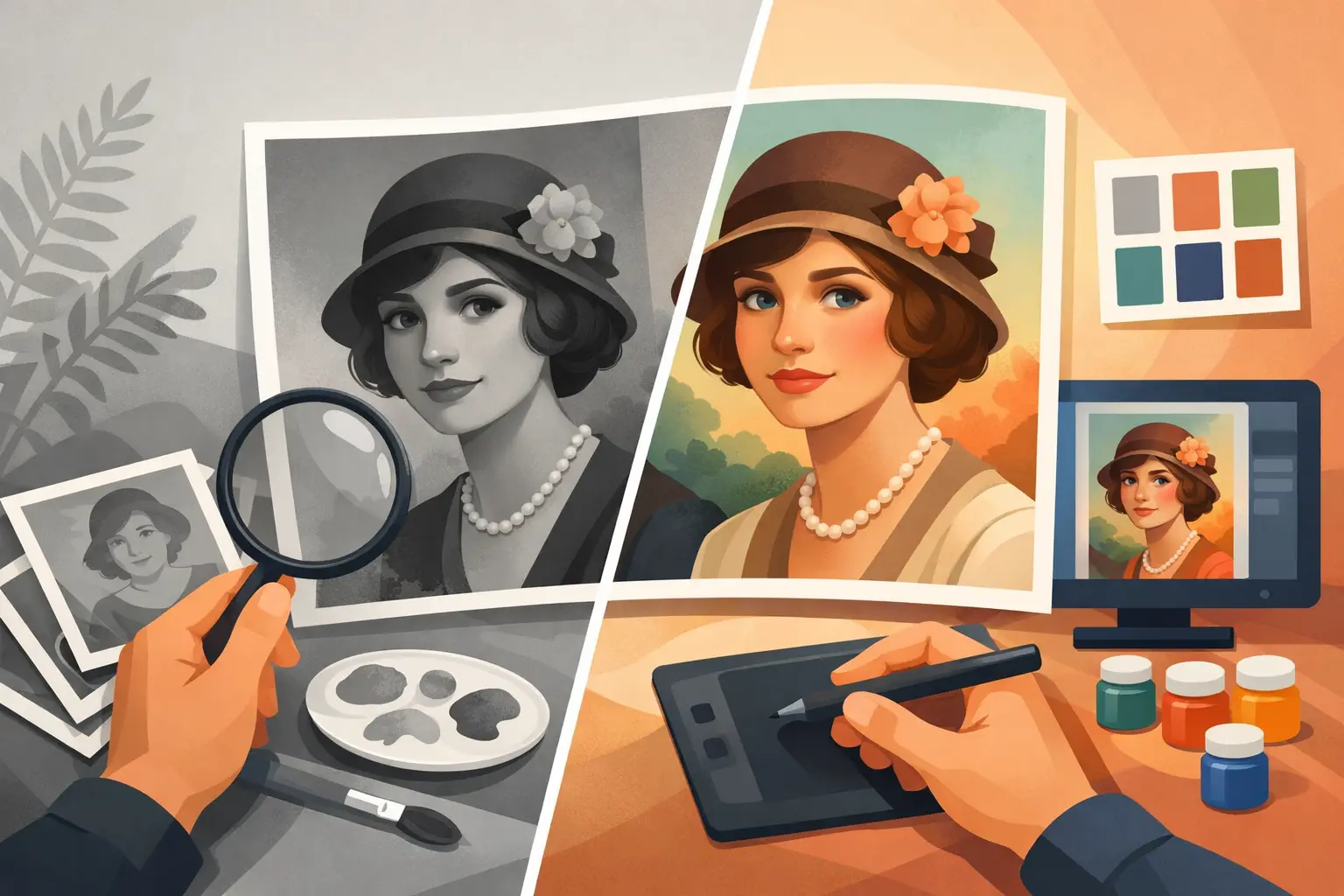
A black-and-white portrait of a grandfather in uniform, a photograph of a mother in childhood or a wedding picture of great-grandparents often keeps more than facial features. They record a moment the family has talked about for years. Colourising old portraits can bring that history closer — provided colour does not cover the truth of the photograph, but helps you see its details.
Well-done colourisation is not a random overlay of colours. It is work on light, clothing fabric, skin tone, background and the realities of the period. The aim is not a contemporary illustration, but a natural digital image that still looks like a family keepsake.
Why does colour change how an old portrait is received?
On a black-and-white print a face can feel a little distant. We know who it shows, but it is harder to catch small elements: eye colour, the warmth of skin, hair texture or the difference between a navy jacket and a dark dress. Well-chosen colours restore depth and mean the person in the photograph stops being only a figure from an archive.
That is especially moving with portraits of people we never had the chance to meet. Colour helps us look at a great-grandmother, a grandfather or a young mother not as characters from a distant history, but as real people of their own time. It does not replace family stories; it gives them a new image.
A black-and-white photograph does not, however, contain full information about real colours. The same shade of grey can mean several different hues. Professional colourisation is therefore based on analysing the photograph, knowledge of fashion and materials from that decade and, if available, clues from the family.
Colourising old portraits needs interpretation
The best result comes when the person working on the photograph does not treat it as an automatic filter. Digital tools can speed the work, but they will not decide on their own whether a coat was olive, grey or navy, or whether the background should stay cool and restrained.
In portraits the credibility of the face matters most. Skin should not be orange or excessively smoothed. Lips, cheeks and the area around the eyes need subtle tonal transitions, because that is where too strong an intervention most quickly creates an unnatural effect. Hair is similar: a flat patch of colour takes structure and the age of the photograph away from a hairstyle.
The date of the print also matters. Uniform colours from the 1940s will differ from clothing cuts and fabrics of the 1960s, and from the saturation typical of 1980s portraits. Colourisation does not have to reconstruct every colour with absolute certainty if sources are missing. It should, however, propose solutions that are probable and consistent with the period.
What can help with choosing colours?
If you know even one detail, pass it on before work begins. The information that a grandmother had green eyes, a grandfather worked on the railway or the photograph was taken at a particular ceremony can change how the portrait is interpreted. Other photographs of the same person, fragments of surviving clothes, family notes on the reverse or relatives’ memories can also help.
You do not have to know the answer to every question. In many family archives the data simply is not there. Then it is more reasonable to use colours that are neutral, calm and consistent with the character of the photograph than to build an overly bold version of events.
Scan and restoration first, colour later
Colourising a damaged print without prior preparation usually gives a weaker result. Scratches, creases, dust, stains and cracks become even more visible after colour is added. The right order of work therefore matters for the final effect.
The original is worth scanning first at a quality that keeps fine details. For family prints, scanning at 600 DPI often works, and for small photographs, portraits that need precise reconstruction or when a larger print is planned — 1200 DPI. Higher file quality gives more room for retouching, but it will not create details that are not on a badly damaged original.
Dirt and small damage are then removed, contrast evened and facial readability recovered. With larger losses, retouching needs caution. A fragment of background can be restored or a clothing line reconstructed, but facial features should not be invented without a clear basis in the photograph. A family keepsake should remain authentic, even when it bears traces of time.
Only on an image prepared that way are colours applied. They are then cleaner, more controlled and do not emphasise paper damage. The finished file can be kept as JPG for convenient viewing and sharing, or as TIFF when archival quality and further processing are the priority.
A natural result does not always mean strong colour
Many people worry that after colourisation a portrait will look too modern. That is a justified fear, especially when the image has intense colours, strongly lightened skin and contrast that does not match an old photograph. Good work keeps the character of the original: soft light, delicate grain and the atmosphere of an old studio or a home photograph.
Sometimes the best choice is very subtle colour. With a poorly preserved portrait, slightly muted tones can look far more credible than full saturation. It will be different with a well-preserved studio photograph, where clearer colours of fabrics and background have a solid basis in image details.
It is also worth distinguishing colourisation from beautifying. Removing an accidental scratch on a cheek is different from changing age, the shape of a nose or smoothing every wrinkle. Wrinkles, freckles and a characteristic look are often the most valuable part of a portrait. They are what let relatives recognise the person, not only a correctly processed photograph.
When is it worth colourising a portrait?
Colourisation works especially well with photographs that have family meaning and that we want to show again: as a gift, a print for a frame, part of a family chronicle or a digital file sent to siblings. It can also encourage a younger generation to take an interest in an archive that until now lay closed in a box.
Not every photograph has to be colourised, however. Some frames have a strong documentary character precisely because of black and white. A good solution is to keep both versions: a faithful scan of the original and a separate file after restoration and colourisation. That way the photograph’s history is protected, and the family gains a new way of looking at it.
If the archive holds more prints, treat a single portrait as the start of a larger sorting of the collection. Scanning, safe naming of files and making digital copies protect memories from further fading, flooding or losing the only copy. At StareZdjęcia the whole process can include preparing prints, digitisation, natural retouching, colourisation and safe return of insured originals.
The most beautiful effect often appears when a finished portrait reaches someone in the family and prompts a simple sentence: “Now I really see who I take after.” It is worth giving such photographs a chance to keep speaking — calmly, naturally and with respect for the people who remain in them.